Dynamic Headers on
Google’s News Mode
Project Overview
Problem
On production, we fall short in helping users understand what to expect in a query result page on Google’s News Mode tab. We give few indications of how results are organized, and offer little recourse if that organization doesn’t meet their needs.
Solution
A flexible top-level system composed of 4 components for all News Mode queries to prime users and preview organization of page.
Role
UX Designer
Team
UX, UXR, Engineering, PM, Team leads
Timeframe
January 2021 - March 2021
Tools
Figma
The Problem
On production, we fall short in helping users understand what to expect in a query result page on Google’s News Mode tab. We give few indications of how results are organized, and offer little recourse if that organization doesn’t meet their needs.
How do we know its a user problem?
85% of all queries on News Mode tab produce a page with single results.
UI can change dramatically between pages, which can be disconcerting to the user.
Users are more likely to look for “latest” information on news mode than web search however 36% of general News Mode users feel the results are out-of-date
The Plan
With flexible headers, we aim to provide an easier and more digestible way for users to explore and understand news.
Helping users understand what they’re about to see and how results are organized
Better setting expectations from the onset
Helping users get the latest updates on a story or topic
Giving users more control over their experience
What are flexible headers?
A flexible top-level system composed of 4 components for all News Mode queries to prime users and preview organization of page.
Headers will operate on a scaling system as we might not always have information available for every feature. Sometimes, we might just have one or two of the features, like on the left, and other times, we might show it in its full capacity, like this location page.
Iterations & Concept study
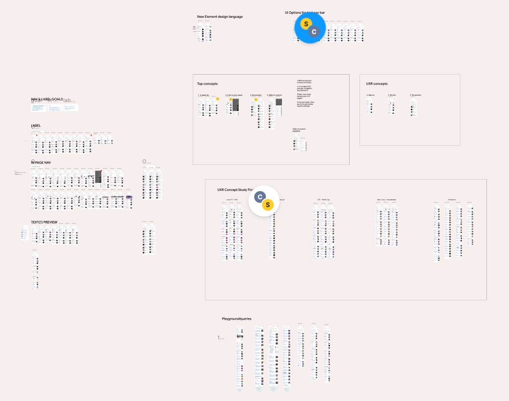
After many iterations of the dynamic headers based on feedback sessions…
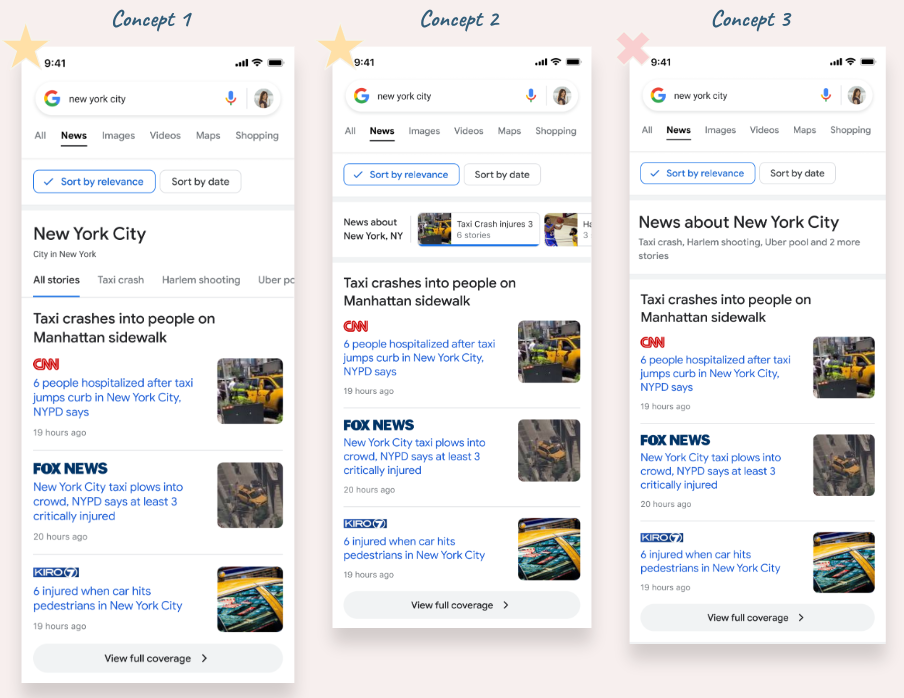
…we narrowed down on 3 concepts we wanted to test with users:
The concept study aimed to get user reactions and provide early signals on potential product directions.
Participants thought all of the concepts were more useful than the current production experience. Participants viewed concepts 1 and 2 (both with interactive navigation) as most useful and reasons for this included: potential time savings, easier to find what they are looking for, and getting an overview of stories.
“I think it's useful that you can click on it (Concept 1). And so visually just helps break it up. It's almost like turning a page as compared to going down a list. When you're going down a list, you forget what's at the top, but when you're turning a page, it's easy to flip back and forth and keep things in mind.” - Participant A
Live experiment overview & results
We also wanted to test one of our first features of the flexible header, the ‘Sort by’ feature.
‘Sort by’ goal: Make it easier for people to get the latest updates on a story by giving them an easily accessible way to filter and sort their results. (This is currently difficult, with 36% of people citing out of date results as a friction point.)
Hypothesis: Introducing a more prominent sort by feature will give the user more control over filtering/ sorting their results so that they can find the news they care about more easily
Significant increase in Sort by date interactions (chip clicks)
Finding results that are relevant (increased result clicks after sbd)
The results that we’re surfacing after sorting are still high-quality and relevant to the query/story
Results: people are clicking the sort by date buttons and adding these buttons (more height) to the page doesn’t seem to have a negative impact on their journeys.
Increase click rate on SBD of +4.18%
66% of users who clicked on the SBD chip, tend to stay in SBD mode
25% of users who click the sort by date button, click on one result are likely to click on a second one (52%).
Next steps…
At this point, I transitioned into a new team. However I believe next steps would be to continue our efforts in creating a full page experience to helps users reach their desired level of understanding. Based on UXR, we had planned to work on six feature areas that we believe would drastically improve Full Pages on News Mode for the better.
The first is “prime users.” On a high level, we want to prime users of what they can expect on the page. What are they going to see? What can they count on? Can they get the latest? Or do they need to filter further or pivot elsewhere? Which we addressed partially with dynamic headers. To further this effort we may consider dynamic clusters to help users grok the important parts of the page by showing relative importance of stories by varying the size based on its importance relative to other clusters on the page.
Second, we want to connect the dots between all the results on the page. Is a story actually a sub-story of something larger? If so, how can we communicate that? Are some results updates to a long-term topic? If so, let’s show that. Possibly but Leveling within pages, presenting a wider view of a given story or query; show which substories are part of stories. Also contextualizing results when possible.
And finally, we want to get users to where they want to go. We want content to be expressive, indicative of what’s behind that tap or that click. We want users to feel like they have control over their experience and can deftly navigate through.
Iterate
Iterate on concepts, applying study feedback
Features
Address additional features to create great full-page experiences to help users reach their desired level of understanding and how will they exist with dynamic headers
Design alignment
Stay aligned with new design directions across platforms
Research
UXR to uncover refinement needs
Test
Test new concepts, iterate, more UXR, rinse & repeat :)


