Sidewalk Gems
Case Study
Brief
Create an app that can solve a problem within your community.
Problem
I wanted to address the thousands of discarded but functional items left on the sidewalks of NYC.
Solution
An app that allows users to easily and effectively find, report and discover second hand furniture and other items left on the sidewalks of New York.
Project Overview
Role
UX Designer, UXR
Team
Solo project
Timeframe
2 weeks
Tools
Figma
The Problem
New York has a prominent ‘stooping culture’, however needs a better system to allow the community to offer and rescue the countless discarded pieces found on New York’s sidewalks.
How do we know its a problem?
Per NYC Reuse Sector Report, in 2017, New Yorkers threw away about 200,000 tons of furniture waste
Per Sanitation Commissioner Kathryn Garcia says, “the study tells us that our efforts to reduce, reuse and recycle our waste are working. The study also shows us that we have incredible opportunities to develop and grow programs to achieve even more. Together, we are working toward our goal of sending zero waste to landfills by 2030.”
So many benefits:
Avoid costs of garbage collection and transportation, which also reduces the associated environmental pollution
Conserves energy and natural resources that would be needed for new goods
Avoids the economical and environmental costs of manufacturing new products
Social & Economical benefits that help alleviate poverty and fight social exclusion
Good Market fit
NYC truly lends itself to the eco-conscious and upcycling movement. Due to its transient nature, people are always moving either to and from the city or even just to and from different apartments yearly.
Main reasons why there is a prominent ‘stooping culture’ in NYC:
As most New Yorkers know, no one apartment is alike and what once fit perfectly in your old apartment now simply doesn't fit and you usually find that out the hard way…on moving day
Most New Yorkers do not own cars, leaving us with limited options when moving or being able to sell/give away our belongings
New Yorkers are forward thinking and prefer eco-friendly secondhand items which rescues it from the waste stream.
The need to save money as we all know New York is an expensive place to live
User research
I conducted 12 interviews with the main goal being to identify and understand user behaviors and experiences with tasks that my product is trying to address.
Main Takeaways:
Wanting to buy second hand items, however is usually more expensive than new items
Wanting more details or better photos
Clear description of status of the item
Would only pick up furniture items (no clothes or food)
Logistics is a problem when you aren't close to home (in NYC)
When they see items on the sidewalk they don’t know how to share (especially on the go, with places to be!)
User Pain points
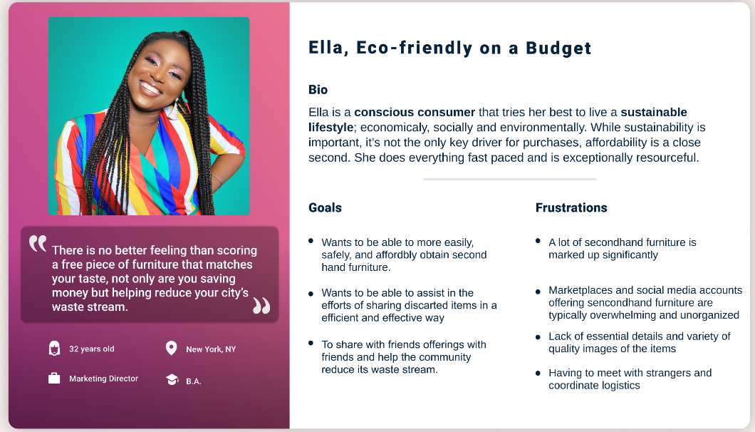
Persona for Mobile App
Ella needs an easy and affordable way to get secondhand furniture and help her community reduce their waste stream
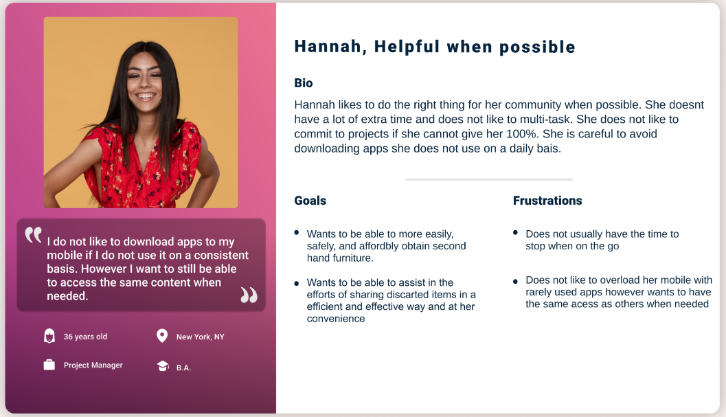
Persona for website
Hannah needs an easy way to casually discover and share discarded secondhand furniture at her convenience
Competitive analysis
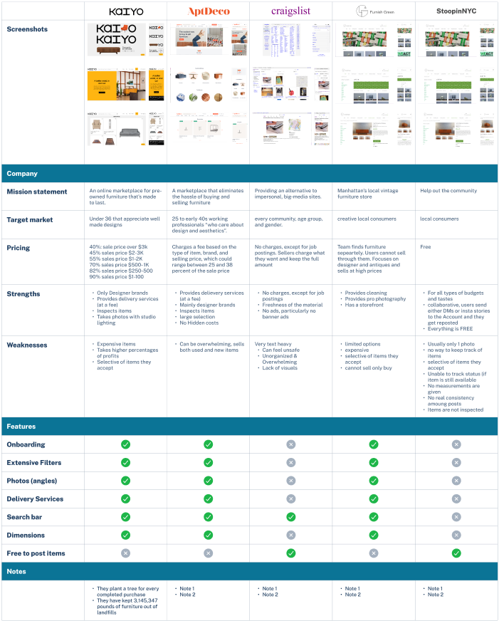
Now that I have defined the users, I needed to delve a little deeper into research. I started with the Competitive Feature Chart, which allowed me to discover who the direct and indirect competition was. From there I started to list the features, missions statements and other criteria each had to uncover any patterns, mental models, and areas of opportunities there might be.
Main takeaways
Most competitors focus on only designer, high end, vintage pieces
4/5 do not address the sea of discarded items on our sidewalks
Items, while discounted from new item pricing, are still expensive
Most charge high percentages of sales revenue (for sellers)
Instagram Account offers free furniture and a collaborative community space however lacks important features such as different photo angles, dimensions, state of item, and status of item.
Per the success of these companies and more notably the Instagram account with a cult following, we are able to see the large amount of people interested in secondhand furniture.
Problem statements
Hannah is a busy professional that wants to be able to contribute positively to her community and environment, who needs an effortless way to share discarded furniture finds because this way she can help her community obtain free furniture and help reduce the waste stream with minimal effort.
Ella is eco-conscious and on a budget who needs to save money while also reducing her communities waste stream because they align with her values.
How might we create a space that allows the user to easily and effectively share discarded
furniture finds as well as hunt one down?
Site Map
Goal for the homepage was to keep it concise and easy to scan
I wanted to ensure the flow was as concise and minimalist as possible in order to provide a quick and easy way for the user to complete their goal. After a few iterations of the homepage, I selected the sections that best encompassed the mission of the app.
After many iterations, I decided on categorizing by borough, as one of the main insights is NYC residents will more likely pick up an item they can get back to their house easily, which requires close proximity as most do not own cars
Goal for the landing pages was to create consistency by applying gestalt principles
Law of continuity
Law of proximity
Usability Study
Goal was to determine if users are able to easily complete core tasks and uncover any user pain points.
Based on 15 Studies with participants ranging from 20 - 40:
1
Onboarding/Instructions
5/7 Participants were curious about what steps would happen next after taking a photo
2
Share Capabilities
5/7 Participants suggested
being able to share posts
3
Measurements
4/7 Participants mentioned they were not sure how to reset the item measurements
Refined wireframes
Before
After
Based on the insight that users were confused when presented with two different save CTAs, I removed the heart and added a way to share the post as that would be needed as well upon further insights.
Before
After
Based on users feeling unsure on what to expect in the next coming actions, I added a way users are able to get a preview.
Before
After
Based on the insight that users did not feel like they would be able to reset the measurements I added a ‘clear’ button
Visual design
Vintage/Retro Feel
My approach for the app was to breathe new life into discarded furniture by incorporating captivating retro color gradients and typography. By leveraging these design elements, I aimed to infuse a sense of nostalgia and style, transforming forgotten pieces into eye-catching treasures.
MVP Prototypes
User flow 1 - Searching for a ‘Sidewalk Gem’
User flow 2 - Posting ‘Sidewalk Gem’
Accessibility considerations
1
Color & Contrast
The design takes into consideration contrast guidelines (WCAG 2.0) and passes with a ratio of 5.07:1 which allows any user to read text easily and comfortably
2
Accessible Copy & Typeface
All text used is simple and easy to comprehend. Based on live studies by Google teams focused on cognitive accessibility, they found Poppins is well received as it is easy to read because of the wide letters & ample spacing between letters
3
Hierarchical headings
The design uses headings to show hierarchy which not only helps users easily navigate the page, but also allows screen readers to interpret the hierarchy of a page for users.
User Feedback
Participants found the app to be easy to navigate and aesthetically pleasing. Participants felt that the concept was important and relevant to our community. They expressed that given its features such as the instant measurements they would be able to easily contribute as well as locate items they might need or want. Participants expressed their excitement and would want to recommend to their friends.
Next steps…
Conduct additional usability tests and concept studies and further diversify the sample.
Usability Testing & Concept Studies
Build out the rest of the app, work on the copy, and concept test additional features that can be incorporated in v2.
Finish build out/Feature Exploration
There is a few different personas I felt where reflected via the data I collected however due to time constraints I focused mainly on 1 while still trying to incorporate all user needs
Flesh out more personas & CUJs


